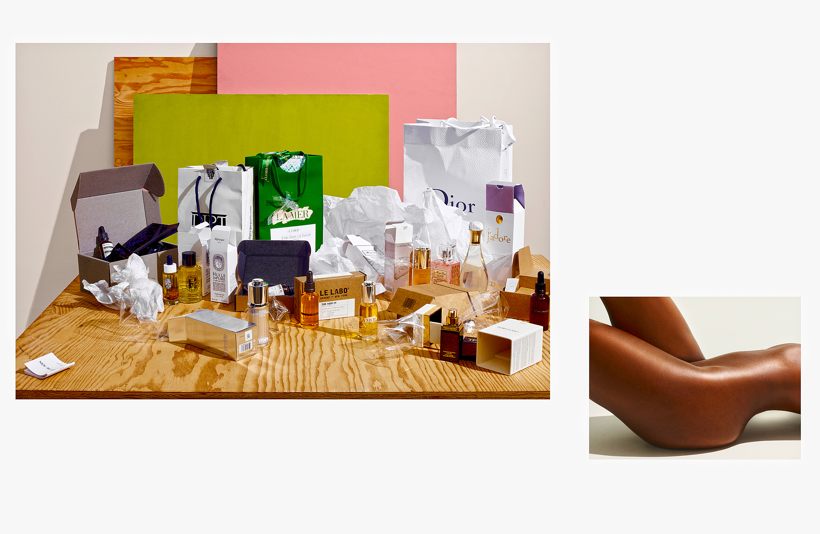
My idea for the story—something I’d wanted to do for quite awhile—was to mix different photography styles: studio still life (my staple), snapshots, images from my archive, and photo/illustration.
For the story I chose a nude image that I’d taken for Glamour Magazine a few years before. The snapshot was of my daughter and her now ex-boyfriend on the beach at Fire Island. For the perfume bottle, I used photo/illustration—a technique I invented—that places a photograph of a product in an environment created in Photoshop.
A few of the images are of the products themselves. In the case of the perfume bottle, though, I decided to focus not so much on the object itself as on its ingredients. The sunflowers, tucked in a vase and a little past their prime, are an homage to Irving Penn’s sunflowers.
The sets were simple—plywood with some colored surfaces casually leaning against the studio walls. The opening shot of the packaging serves as a sort of anti-product image.
All in all, the story breaks the conventional mold of similarly styled images of products and instead presents a unique, handcrafted product story.


